There was a time when I thought a good interface had to prove how much it could do. More buttons, more color, more motion, more information packed into every corner. I mistook activity for usefulness.
That changed while I was building alongside other people. I watched someone hesitate before a button, search for an option that should have been obvious, and lose confidence because the screen gave no clear answer. The problem was not that the person needed a tutorial. The interface had simply made the next step harder than it needed to be.
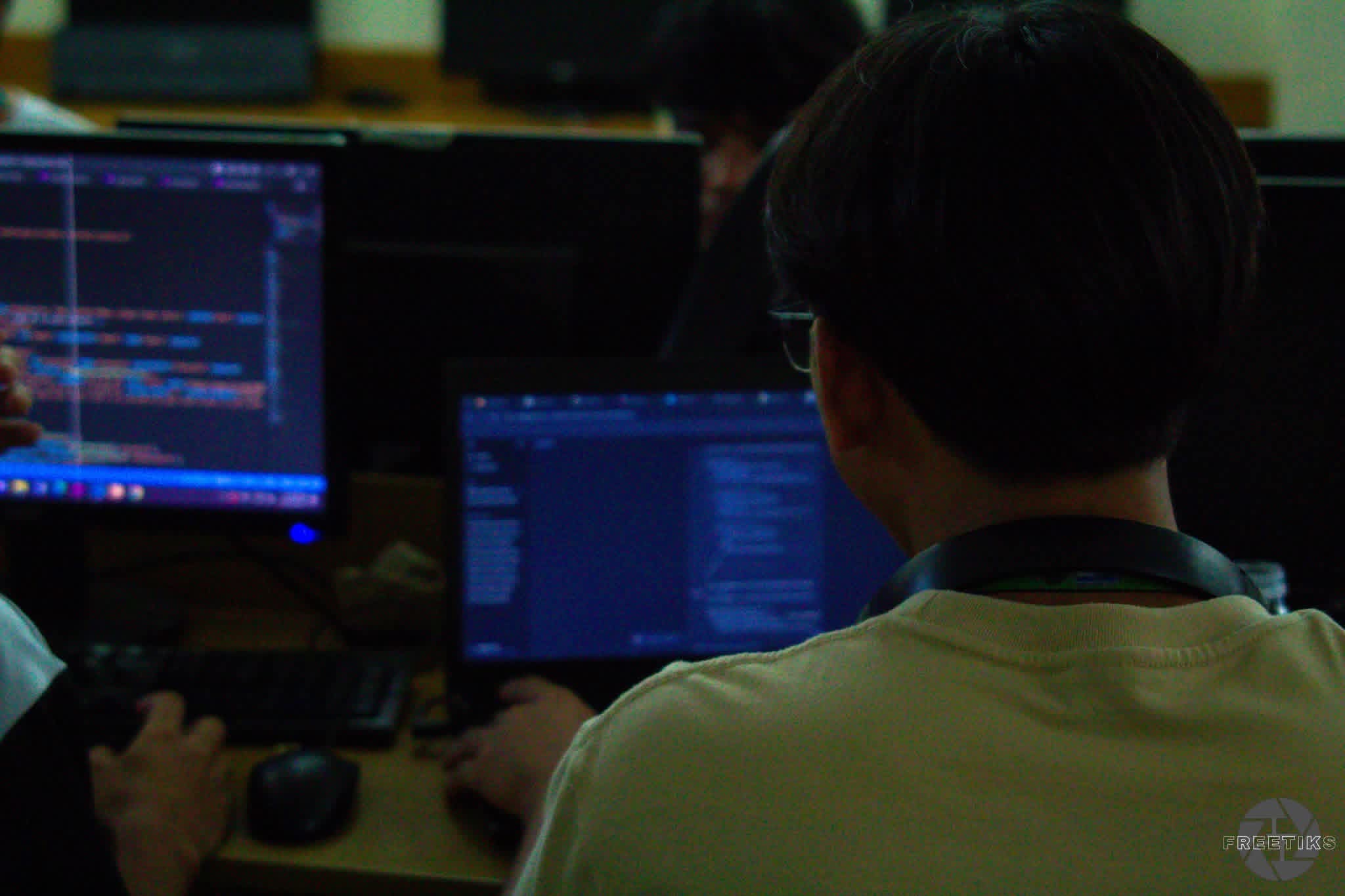
The lesson is in the pause
Good interfaces do not compete for attention. They create enough structure for people to move confidently, then get out of the way. A quiet screen is not an empty screen; it is a screen that knows what deserves to be heard.
I start with hierarchy: one clear action, useful spacing, and language that answers the next question before it is asked. I remove anything that asks the user to decode the design before they can use the product. If every element is loud, nothing is truly helpful.
Designing for confidence
Clarity also lives in the small moments. A button should look available when it is available. A form should explain what went wrong without making someone feel at fault. Loading states should acknowledge the wait. Empty states should offer a beginning instead of presenting a dead end.
The best details are often the quietest ones: sensible defaults, readable states, and feedback that arrives exactly when it is needed. These choices may not appear in a screenshot, but they change how safe a product feels to use.
A calmer way to build
Now, before I add another feature, I ask what it gives the person on the other side of the screen. Does it reduce uncertainty? Does it make a decision easier? Does it respect their time? If the answer is no, the feature may be solving the wrong problem.
That is the lecture I keep returning to: calm is not a visual style we apply at the end. It is a discipline of listening, editing, and choosing the clearest path. When the interface becomes quieter, the person using it gets more room to think.
What the classroom taught me
I learned this lesson in lectures too. A good teacher does not place every idea on the board at once. They introduce a question, give it room, connect it to something familiar, and only then move toward the difficult part. The best lessons have rhythm. They make space for confusion without allowing confusion to become permanent.
That rhythm is also present in good product design. A new user needs an invitation before they need a feature list. A first-time action needs reassurance before it needs speed. An unfamiliar screen needs landmarks: a title that explains the moment, a short instruction that points forward, and feedback that confirms the person is still on the right path.
When I design now, I imagine the interface as a patient lecture. It should not show off everything it knows. It should guide someone from one idea to the next, answer the question they are likely to ask, and leave them feeling more capable than when they arrived.
Editing is an act of care
Calm also requires saying no. Every label, card, animation, and notification competes for a small piece of attention. Adding something may feel productive because the screen looks fuller, but removing the unnecessary can be the more thoughtful decision.
I have started reviewing interfaces with a simple set of questions: What is the person trying to do? What might make them hesitate? What can I explain before they make a mistake? Which part of this screen deserves to be remembered, and which part can quietly disappear?
The answers are rarely dramatic. Sometimes the improvement is changing a sentence, moving a button closer to its context, giving a form a useful default, or letting a page breathe between sections. These details are easy to overlook because they do not announce themselves. But together, they determine whether a product feels welcoming or exhausting.
The kind of designer I want to become
I do not want to build interfaces that make people admire the interface. I want to build tools that help people finish something, understand something, or begin something with less fear. The design should be present enough to support them and quiet enough to let their purpose remain at the center.
That is why I keep returning to calm. It is not a trend, a color palette, or an excuse to remove useful complexity. It is a promise to respect attention. It means making the next step visible, making mistakes recoverable, and making the experience feel like someone thought carefully about the person on the other side.
There will always be more features to add and more impressive patterns to explore. But the work I am most proud of usually comes from a smaller decision: the moment I chose clarity over decoration, understanding over speed, and a little more room for someone else to think.